2017

This article was originally posted at Haute Macabre in April of 2017.
As a child, and even today, I am utterly transfixed when confronted by ornate wallpaper patterns. I often find myself stopping mid-sentence, entranced, when tracing the intricate imagery with my eye, delighted by surprising things which begin to emerge from the whorls and swirls of the repeating motifs. I always thought it would be a hoot to try and sketch the things I saw contained within those marbled, mottled microcosms, but in the end I never do. Though, artists, I do wish you would steal that idea and make a collaborative coffee table book with your results. I’d be your first customer!
The wallpapered visions of my childhood, in the late 70s through early 80s, were pretty trippy, and sometimes gave me nightmares (I was a weird, impressionable kid, and I suspect I experience pareidolia), but you know what? For all of my histrionics and delayed bedtimes, at least I can say that they never poisoned me.
Unfortunate souls purportedly poisoned by arsenical wallpapers in the mid-to-late 1800s, however, would no doubt beg to differ.

Long regarded as a waste product from mining and commonly known as a poisonous substance, arsenic nonetheless had myriad uses in the Victorian household: in food and food colorings with which one ate and entertained, in lady’s soaps and cosmetics applied to one’s person; in the dresses, hats, and stockings that one wore on a daily basis and special occasions; in the painted toys one’s children delightedly played with (and probably put in their mouths, because, children); and not to mention the handy powder used to rid one’s home of vermin…or to rid one’s self of a few pesky relative or two– hence the nickname “inheritance powder”.
And, of course, for interior design.
In 1775 Swedish chemist Carl Scheele developed the vivid green pigment known as Scheele’s green, made from the compound copper arsenite; the depth of color and superb pigmentation made it highly sought after for clothing and interior manufacturers–perfect for domestic décor and to color the florid opulence of the paper hangings that were so desired during this period.
Floral motifs, arabesque designs, and trompe l’oeil illusions, as well as panoramic landscapes, were the distinctive style of the French designers, whom the British admired for their air of elegance and luxury. The tide was to shift, however, in favor of the British, whose skilled block-printing and imaginative and innovative designs were considered so fashionable that the French employed spies to discover the secrets of the papiers d’Angleterre. Who knew the world of wallpaper manufacture and design was so thrilling? I can almost imagine these creators as contestants on a reality television show…except…there is of course, a deadly twist.

During this time, England and many European countries produced wallpaper laced with arsenic. And while several of them were relatively quick to recognize the problem and ban such products—this was not the case for England. Even as the products’ hazards started to become a hot-button topic in drawing rooms and gentleman’s clubs, many people actually pooh-poohed these warnings as fear-mongering, as they still believed that these design items somehow differed from purposely toxic arsenic items. It would be several years and many campaigning committees, committed lobbyists, shocking headlines, satirical cartoons, and even a sensationalist novel before opinions were to change.
Over in the US, chemist Robert Kedzie included examples of wallpaper poisoning in his “Poisonous Papers” essay for the Michigan State Board of Health, and as part of a campaign to alert the public to the dangers of arsenical wallpapers, Kedzie collected wallpaper samples from stores in Detroit, Lansing, and Jackson, and hand them trimmed into 100 books, which he distributed to libraries throughout Michigan. Titled Shadows From The Walls Of Death, the books were remarkably effective means of publicizing the dangers of arsenic in wallpaper.
William Morris, an artist and designer associated with both the Pre-Raphaelites and the Arts and Crafts movement, designed some of the most iconic wallpapers of the era (and, incidentally, was the son of the man whose company was the largest arsenic producer in the country).
Like many of his contemporaries, most of Morris’s well-known early designs contained arsenic-based colors and like most Victorians he seems to have experienced a disconnect as it relates to the poisonous arsenic that made the headlines and that which he used in his design pigments for the beautification of people’s homes. Morris summarily dismissed health concerns about arsenic-based pigments in wallpapers. A letter written by Morris to his dye manufacturer in 1885 states, “a greater folly is hardly possible to imagine: the doctors were bitten by witch fever.”
No problem here, Morris assures us, nothing to see, carry on! A strange and rather blasé attitude from someone thought to be an environmentalist and champion of worker rights and safety provisions.
Nonetheless, Morris & Co. bowed to pressure and removed arsenic from its wallpapers voluntarily in 1880. While in other countries such as Sweden, Denmark, Austria and Italy, it was the development of regulatory measures and legislation prohibiting the use of poisons and other harmful substances, the wallpapers in Britain began to be marketed as arsenic-free “entirely as a result of British demand, rather than by any action of the British government.” As general opinion turned against the companies that used arsenic in their wallpaper colors, “the people of Britain used the power of their pocketbooks to make the presence of arsenic in wallpapers obsolete, and as a result, their homes no longer held a fatal secret.”


I’ve been ruminating on the captivating and dangerously beautiful Victorian wallpaper facsimiles in Lucinda Hawksley’s Bitten By Witch Fever for a few months now, and wouldn’t you know– as soon as I sat down to start writing something about it in the last few weeks, not one, but two articles about the very same thing appeared on my radar. It would seem that this toxic topic holds a macabre fascination for us, even today.
And as usual, such interests are cyclical; back in 2003 Andy Meharg of the University of Aberdeen in Scotland published a piece regarding a chemical analysis performed on an early example of the ‘Trellis’ pattern wallpaper. The Trellis pattern is believed to be Morris’s first wallpaper and was produced from 1864 onwards. In damp rooms, it is believed, fungi living on the wallpaper paste turned the arsenic salts into highly toxic trimethylarsine and sickened people. Reports Meharg: “I analysed the green pigment by energy-dispersive analysis and showed unequivocally that the coloration was caused by a copper arsenic salt.” Interestingly, enough, two years later in 2005, a Royal Society of Chemistry published an article titled “The toxicity of trimethylarsine: an urban myth” and in attempting to read it, I’ll admit, it’s a bit over my head, but my point is that it would seem to be an enduring obsession.
Let us for now then, gaze at these exquisite plates and wallpaper tiles from the relative safety of our computer screens, or from the pages of Hawksley’s stunning compilation, without fear of “internal irritations”, paralysis, and other mysterious illnesses.


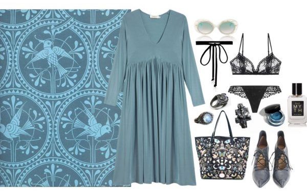
And OF COURSE, we also need to fixate on How To Wear Arsenical Wallpapers! How might a contemporary quaintrelle incorporate the look of this luxuriously poisonous pigment into one’s wardrobe? Inspired by the elegant floral motifs and arabesque patterns of William Morris’ toxic wallpaper designs, I have assembled an assortment of ensembles for which to conjure couture fatale feels.


Elle says
So in love with that green and silver rococo sample! I always hear Gene Wilder and his lickable wallpaper routine in the back of my mind anytime I try to contemplate wallpapering anything.